
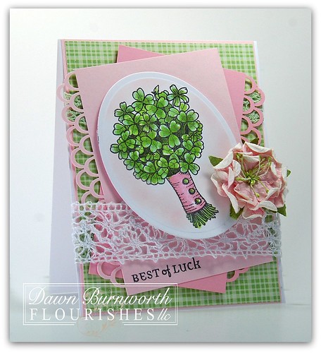
It is time for a Flourishes Friday post. This week I have 2 cards for you. They are polar opposites from each other. The first card I am featuring today is the Flourishes Irish Blessings set.
I colored this image with Flourishes Copics Collections:


I stamped the image out onto Flourishes Classic White Cardstock. I used my Grand Calibur to cut out my Classic Oval Die. I added some crocheted lace and a little flower.

My second card is for Teapot Tuesday over at Splitcoaststampers. This is one of my favorite challenges. I haven't played in so long. Each week there is a teapot for inspiration and then they have a destination for the card. It is a wonderful group of stampers. This week the cards go to a SCS member that tragically lost her husband. She wants to some day have a house on the beach. So I pulled out Beach Life from Flourishes and got to watercoloring it. I used my Grand Calibur again and the Labels 23 die. I added some gingham ribbon and a few little pearl flourishes. Simple card that took FOREVER to watercolor.
Check out the rest of the Design Team's creations:
Both of these have amazing colors! Just love your coloring as usual
ReplyDeletewonderful card dawn your other cards are great too
ReplyDeletehugs Lia
This is just beautiful! All are amazing!
ReplyDeleteBoth are gorgeous...but then I don't think you 'do' non-gorgeousness! xx
ReplyDeleteThe frirst one is a supprise for me Green and Pink... I would not have tried that, but it looks very pretty together! and of course your coloring makes it perfect too!!!
ReplyDeleteNow the second card is so special, the whold look is nice! Love when you use your BIG dies for the card base, it just make the whole card stand out!
Both cards are soooo beautiful, but my favorite one is the pink and green.
ReplyDeleteLOVE the pink and green - perfect spring colors and spring is coming soon - woohoo! The beach scene is gorgeous! Love the vibrant colors against the white BG!
ReplyDeleteBoth cards are gorgeous, Dawn! Fantastic coloring of the bunch of clover and a really stunning beach scene! Have a good weekend! It's supposed to be pretty stormy here tonight.
ReplyDeleteLove that shamrock bouquet and the punched edges are fabulous.
ReplyDeleteGorgeous cards, Dawn!
ReplyDeleteGorgeous creations, Dawn! The pink is beautiful with the shamrocks!
ReplyDeleteSo pretty and feminine! I love the border edging on the layers. And YUM that looks like a place I'd like to be now too! Gorgeous scene!
ReplyDeleteLove all the pretty pink and green femininity of your first card and -- WOW -- the second card is stunning! Fabulous color, beautifully done, and destined to lighten the heavy heart of the one who receives it.
ReplyDeletePolar opposites is right! But both are gorgeous! I love the first card & the way you did the border punch on each paper was inspired! Loved the look it gave your card. The watercolor is just awesome. You did a beautiful job on that one as well. I don't think you could do a card that wasn't spectacular!
ReplyDeleteI hope you aren't in any of the storm areas right now. Stay safe!
Such lovely cards, Dawn! I am so drawn to your beach scene because of the bold colors, but then again, I have always loved that Flourishes Irish Blessings stamp set :) You are truly multi-talented :)
ReplyDeleteBoth are amazing Dawn. Love the pink and green combo. :)
ReplyDeleteI really wish I were at that beach right now. LOL
Hugs~
They are polar opposites, but they both rank WAY up there on the GORGEOUS scale! You have such an eye for detail, Dawn. Love those pretty edges on the pink card layers, and your watercoloring on the beach scene is INCREDIBLE!
ReplyDeleteHow wonderful. I been sitting here studying both cards and I cannot make of my mind which one I love best. Like you said they are opposites. Both are beauties.
ReplyDeleteDawn
ReplyDeleteJust beautiful, bright and happy colors! I could hear the ocean and feel the sunshine in this card! Loved it! Hugs ~CaroleAnn
Two lovelies! Both very different and both very pretty! Love your sunset. I fancy being in that spot right now! Hugs, Lesley
ReplyDeleteI love the soft pink on your beautiful shamrock card! The teapot inspired card is tropical and gorgeous! Wish I was there!
ReplyDeleteThey are both gorgeous. I especially like the shamrocks the pink and green is so striking. I really love it!
ReplyDeleteCarole
http://scmagnolia.blogspot.com/
Beautiful, Dawn! You always bring such a touch of uniqueness and charm to your cards!! I love the pink and green for shamrocks, and the second scene is very life-like!! What an encouraging card this will be!!
ReplyDeleteLove the shamrocks on pink and green! The beach scene is spectacular!! Could you teach me to watercolor like that? Lol!!
ReplyDeleteI love the pink with the St. Patrick Day's card! And the deep colors of the beach scene are fabulous!
ReplyDeleteBoth of these are wonderful Dawn. Fresh and springy first one. Gorgeous coloring and scene on your second card.
ReplyDeletewell.....I first saw the green/pink beauty and was totally in awe....just the perfect touch of lace and a great layout....as well as your siignature coloring......then I ventured down a bit to that dramatic and stunning beach card.....I couldn't pick a favorite between these two.....very different from each other, but both so very fabulous...WOW
ReplyDeleteBoth of these are lovely but that bundle of Shamrocks really makes my eyes pop out. Love the coloring on both of these two lovely cards.
ReplyDelete